We recently wrote about a string of lawsuits targeting municipal governments in Florida.
The charge?
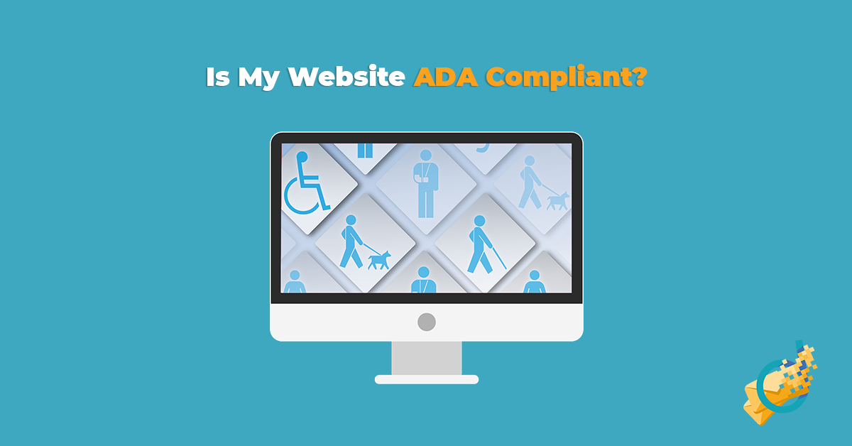
Their websites were not ADA compliant.
This has sent shockwaves throughout the country, with many cities in particular concerned about what this implies about their obligations regarding their websites.
So today we’re going to dive in a little deeper and look at what you, whether a city government or business, can do to discourage opportunist lawyers from coming after your website.
But ADA compliance is a complicated topic. To make understanding your obligations a little easier, we’re going to divide the subject into a few categories that many websites have issues with.
Breaking it Down
ADA compliance in the physical world is all about addressing common issues faced by people with diverse disabilities.
These include things like ramps for wheelchairs, or braille for the blind.
Elevators, closed captioning, large print text. All of these are ways to help make the world a little more accessible for everyone.
The same logic applies to your website as well. There are unique challenges faced by those who are blind, deaf or motor impaired.
So let’s get started:
The most common issues can be broken down into the following categories:
- Image & Video Issues
- Audio Issues
- Navigation Issues
- Compatibility Issues
We’ll start by looking at images & videos.
Images & Visual Materials

The foundation of ADA compliant web design is making sure everything works for everyone.
One of the most common accessibility issues online relates to visual information.
Contrary to what you might think, visually-impaired people are on the internet. And they need to access the same information as everyone else.
Unfortunately, many web designers have the tendency to use visual materials to convey important information.
An image might contain an important chart or table, a video can have text popping up, or it could be a relevant photograph that provides some extra context.
Now purely decorative images aren’t the issue here. What we’re talking about are images that have real information.
ALT Text, Captions and More


Take a look at the above images, both from our own website.
As you can see, one has text overlaid on it directly. But the other, a screencap of our homepage, has text that’s highlighted by the mouse cursor. Which means that it’s directly on the page itself.
This is a huge difference when it comes to ADA compliant design.
A screenreader can’t, by default, read the image on the left. But it can read all the text that’s on top of the image on the right. That’s because the text on our homepage is part of the website’s HTML structure.
So how do you make the left image ADA compliant? How can a screenreader read the text on top of it?
In order to make the left image compatible, there are a few solutions available. One is so-called “ALT” Text. This is an HTML attribute that provides an alternative text version of an image. For most of us, we will only see this if an image fails to load.
But for those who use screenreaders, their device may, in fact, read this text aloud to them!
So it’s crucial that every single image on your website has some form of ALT text in order for everyone to access it.
(This also happens to be SEO best practice – which is an added bonus!)
But that’s not your only choice here. You can also provide a text caption below the image. This doesn’t need to be anything special, just a one-line caption that restates what’s on the image for those who can’t access it.
And finally, for images at least, there’s what’s called an HTML “longdesc” attribute. Think of this as long ALT text, in that it provides context for your image. But instead of displaying when there is no image, it provides a detailed description of the image in its context. This can also be helpful for screenreaders.
The choice is yours, but all images that convey information need to be accessible – even to those who can’t see them!
Videos – Transcripts & Audio Syncs
Videos are a tough one for ADA compliant design.
That’s because they can have two issues, affecting two different types of disabilities, at the same time.
Depending on how you use them, a video might convey important information visually and aurally. Text might pop up, preventing the visually impaired from receiving important information, or audio information might be lost on someone who’s hearing impaired.
So what do you need to do?
The best thing you can do to guarantee accessibility for your videos is to provide three things for users:
- A text transcript below your video
- Closed captioning for the hearing-impaired
- A synchronized audio track with any/all text and meaningful actions on screen for the visually impaired.
It’s a lot of work, to be sure. Especially on top of the already labor-intensive video production process! But videos are incredibly popular with those who can see them, and you can’t skip making them available to everyone.
(Fortunately, text transcripts are yet another great SEO best practice. It’s not just the hearing impaired who can read them, Google crawlbots can too!)
Even beyond the hearing impaired, text transcripts are helpful to people with audio-processing disorders, attention disorders or any other cognitive difference that makes it harder to keep pace with fast-paced audio. Providing an alternative transcript opens the door to a whole new audience of people who might otherwise have struggled to access your content!
Colors & Contrast

Many web designers use color to distinguish elements, provide some “pop” to a page or to segment their page into different subsections.
And for many of those same designers, that’s where they leave it. Those are the only ways they distinguish elements.
And that’s a big no-no for ADA compliant design.
Because visual impairment doesn’t just include blindness. It also includes colorblindness.
And there are three main types of colorblindness too!
Color issues come in many forms, including contrast being too low, color differences being indistinguishable, or some users being unable to see color at all!
Here are a few key things you need to do:
- Keep all (small) text at a 4:5:1 contrast ratio, and large text at a 3:1 ratio
- Adjacent objects must have a contrast ratio of 3:1
- Color alone must not distinguish elements (think links, headings, navigation)
Now I don’t know about you, but I can’t look at two colors and immediately think to myself “Hmm, looks like that’s a 3.9:5:1 contrast, looks like we’ll need to fix that up!”
So here’s an incredibly helpful tool for calculating the ratio between two colors!
Audio Materials

We’ve already touched on one component of how ADA compliant design factors in with hearing impairment.
But the even more obvious issue facing the hearing impaired is that, you guessed it:
They can’t hear things.
So if you’re one of the many businesses, organizations or individuals who have a podcast, put up music or have interviews hosted on your website…
Then you’re going to have to address that. Fortunately, the solution is one we’ve already touched on:
Transcripts.
That’s right! Everyone’s favorite SEO-friendly solution to videos is back!
Whenever you host audio materials, you need a corresponding transcript that can be easily found and read by someone who is hearing impaired. This transcript needs to meticulously detail speech and speaker, and any contextually important sounds that go on within the recording.
As someone who (briefly) worked as a transcriptionist, I can tell you that writing a transcript is labor-intensive and tedious. But it’s not particularly challenging work, so long as you’re working from a recording.
But you need a transcript. Besides, it’s making the world more accessible for more people. And that’s a good thing!
ADA Compliant “Usability”

For this last, catch-all section, let’s talk about what I’m informally calling “Usability” issues.
This is a broad category that includes things like file compatibility issues, navigation troubles and other HTML problems.
Because it’s such a broad category, these issues affect people with all sorts of disabilities. From visual or hearing impaired to the motor impaired, these problems affect the user experience (or UX) of a large group of people. And it’s up to web designers everywhere to make it easier to access our websites!
Navigation

For those with motor disabilities – sometimes known as limb different – navigating a website with a mouse can be a unique challenge. Precise movements and exact clicks are tougher if you have trouble moving in the first place.
To that end, web designers can help make website navigation easier. Every webpage on your site should be easy to use and navigate using just the keyboard.
There are two big components to this:
- Elements should be tab-navigable (i.e. you can tab to important elements and scroll up/down using keys)
- There should be a “Skip to Content” option before the main navigation menu so a person does not need to tab through all navigation links to access content
Most websites, by default, will allow users to tab to elements like links or buttons. But the issue is when it’s not immediately clear what element you are selecting. Many websites lack a hover-focus highlight. This is most commonly a dotted line box surrounding the element that is selected. It makes it a lot easier to identify what you’re hovering over, which is a huge boon to navigating a page.
That latter requirement also helps those using screenreaders, as it means they don’t need to listen to 20 instances of the same menu over and over again.
Time Limits & Gated Content

There are some cases in web design where you may want to put a time limit on reading a page. This is particularly common on landing pages for specific offers, or something to that effect.
But the problem with this sort of content is that it creates an unnecessary burden for those who are slower at reading, have a harder time navigating a page or rely on a slower device to help them read a page.
As such, it’s best practice for ADA compliant design to ensure that any time limits you have on a page can be extended or skipped. It may seem self-defeating, but keep in mind that it is unduly unfair to those with unique challenges to bar them from the same content.
Links & Link ALT Text

Links provide extra information and resources for page visitors. It’s also the best way to guide navigation around your website.
But the fact that HTML links can easily wrap around elements like images means that sometimes, there isn’t an immediately-clear context for them. This is especially true for those using assistive devices!
That’s where link ALT text comes in. As you can probably guess, this is similar to ALT text for images – it’s used to interpret and contextualize links in case their original display doesn’t work.
Furthermore, even text links need some extra care for ADA compliant design. Make sure that your anchor text provides all necessary context. So, in other words, don’t have your links simply state “Click here!” or “Learn more!” and instead make sure that they’re informative, or at least easy to interpret within their larger sentence.
You’re probably noticing a pattern by now:
ADA compliant design hinges heavily on good HTML code and coding best practices.
We’ll get into the “Why?” a little later. For now, let’s look at another common ADA issue and what you can do about it.
Heading Structures

HTML headings are the tags numbered 1-6 that wrap around text that form the outline of a webpage. Think of headers – and the structure you construct with them – as an outline, sort of like for an essay or presentation.
Unfortunately, many developers misuse these tags and create an unhelpful hierarchy that can confuse users and, more importantly in this case, devices used to assist those with handicaps.
So the best way to maintain an orderly and logical heading structure is to use a logical, incrementing hierarchy throughout the page. Only decrease heading levels by one per subheading (so no going from an h3 to an h5). Don’t start the page with an h3 if there’s no h2 or h1. Make sure that the hierarchy makes logical sense – an h3 below an h2 should be a subsection of the broader h2, not its own point or section.
And whatever you do:
Don’t wrap text in a heading if you just want to make it bigger or bolder. That’s what CSS is for.
Labels, Forms & Attributes

Most websites have a contact form. This can be a way for prospective customers to ask questions, users to submit complaints about the website or to inquire about purchasing something.
But contact forms aren’t always intuitive if you don’t follow – you guessed it – HTML best practices.
In particular, we’re talking about the label attribute, as well as a few other tricks to ensure users understand the purpose of a form.
This attribute, which is linked directly to each part of a form, is the label on a field that says what that field is for. You would think this is a no-brainer to have, right?
But so many forms don’t have this! Instead they rely on placeholder text, which is a useful trick to use. And it’s one that can help with ADA compliant form design too. But it should be used in tandem with a label!
Clean Code

Finally, our last entry in usability – and in ADA compliant recommendations in general – is a bit of a catch-all that includes much of what we’ve already touched on.
We can’t emphasize enough how important having clean HTML code is for your website.
This isn’t just about ADA either. Making your website clean and usable on a technical level can help SEO, as well as any future developers who take over your site.
Clean code is critical, though, because it decreases the risk of confusing screenreaders, assistive devices or, indeed, search engine crawlbots.
But what do I mean by “clean” code? I’m referring to best practices in web design, such as avoiding the ever-present risk of “divitis” or using deprecated HTML code that isn’t up to web accessibility specifications.
Which brings me, seamlessly, to a crucial juncture:
Where is all of this information coming from?
Who Determines What Is (And Is Not) ADA Compliant?

The truth is:
There’s nobody setting clear and concise rules for ADA compliant web design.
Anywhere.
That’s actually the single scariest factor about all of this for most web designers, businesses and governments. There are a string of lawsuits, sure, but nobody’s entirely clear on what responsibilities website owners have to make their site accessible. It’s unclear what is, or is not, considered an undue burden, or is a reasonable accommodation.
In fact, despite several lawsuits going through against municipalities throughout Florida, one lawyer – who alone has filed 653 ADA complaints – has recently been targeted by a federal judge.
So what’s the point then? Why did I bother waiting until now to tell you this?
Because, despite this ruling, every business or government is at risk until further notice.
But then what can you do? Where do all of these best practices come from if nobody’s calling the shots?
Well, despite there not being a real central authority for ADA web design, that doesn’t mean there aren’t reference materials that courts use to judge these cases.
And you know what the biggest single resource is for all of this?
WCAG 2.0 – or, to break down the acronym Web Content Accessibility Guidelines.
While not a perfect benchmark, and we’ll talk all about resources and other guidelines to follow, WCAG 2.0 is one of the most popular resources to use for ADA compliant design. It’s what we use at DME Digital to assess whether or not a site is clean and ready to go.
Resources, Tools & Auditing

Phew.
That was a lot to take in, right?
Well, we didn’t call this an “Ultimate Guide” for nothing, now did we?
But it’s time to start drawing things to a close. Don’t worry, though – we’re not going to leave you hanging:
We want you to be informed, so we’re going to provide you with a ton of resources, links and checklists that you can use to audit your site, make changes, and understand your role in making a site ADA compliant!
Checklists
These are the checklists and reference materials you can use to judge if your website is ADA compliant:
This checklist breaks everything down by category, topic and issue. It’s immensely useful, but it’s also incredibly robust. You should know a thing or two about HTML and CSS before using this one.
This one’s an official resource from the ADA department in the US Justice Department. It’s barebones, but provides a basic overview of important concepts you need to know. Just understand that being able to check every box isn’t, necessarily, enough to call yourself ADA compliant.
Here we have a pretty simplified version of the above WCAG 2.1 guidelines, formatted in simple, human-readable language. It’s much more user-friendly than it is technical to use. But it summarizes all of the key information you absolutely need!
Auditing Software
What we have here are a few resources we use to gauge the ADA compliance of websites and individual pages, along with a brief explanation of how we use them and what they’re best for.
You input a URL into this tool, and it automatically checks the accessibility of any individual page. Now, this is a Canadian site meant for Canadian disability requirements, but it’s based on WCAG 2.1 – so the principles are the same. Anything you see as an error on this site holds, roughly, true for ADA.
This is one of my favorite tools. It’s a simple Chrome extension that you can use by activating Chrome Dev Tools that will automatically analyze the page you’re on. You can then highlight problem spots both visually on-page as well as in the code itself. Very helpful for diagnosing fixes!
The WAVE Web Accessibility Tool let’s you input a URL and then navigate around the website, highlighting problem spots or just general information for accessibility. It’s useful for understanding how WCAG 2.1 guidelines affect individual elements on your page.
NVDA is a free screenreader software that you can download on any computer and use to test how your page will work on a real screenreading software. Very helpful for testing fixes for visual issues on your website.
Plugins & Quick Fixes
These are some quick plugins (particularly for WordPress) that can resolve some accessibility issues for your website. Please note that these will not resolve all of your problems, and only a dedicated ADA strategy will be sufficient to make your website accessible.
This neat little plugin fixes a lot of the simple problems for a website. It allows you to add a “Skip Navigation” button, adds a focus highlight to elements selected via the Tab key, allows longdesc attributes on images, and more! Pretty cool for making manual fixes a lot easier.
One issue that hinders accessibility for some users is the inability to resize text while maintaining legibility. This simple plugin can help resolve this – and helps you check off one part of WCAG 2.1 guidelines!
Contact Form 7 is one of the most popular contact form plugins for WordPress websites. Unfortunately, not all of its default options are accessible. Now, it’s a simple fix for those who know some HTML – but if you don’t, then this little plugin can help resolve that.
Feeling Overwhelmed?
I get it, this is a whole lot of information. And I also know that not everyone’s a web developer.
But everyone, and I do mean everyone, needs an accessible website.
If you’re not confident in your own abilities, however, there might be a solution.
You see, we happen to know some folks…
Some folks who just wrote the “Ultimate Guide” on ADA Compliant web design…
So if you’re feeling lost, stuck or in need of some help…


Leave a Reply